— Midas Fintech Solutions
As a core design member in the team, I was given the task to streamline the design process and help the developers to reduce the development time for new features and products launches.
FINTECH
STARTUP
RESEARCH
ATOMIC DESIGN APPROACH
UX DESIGN
VISUALS DESIGN
DOCUMENTATION
Numbers don't lie
❖
The result
❖
THE PROBLEM
When I joined Midas, there was no collection of common design patterns or components library and had inconsistent font hierarchy across products. Developers were creating designs by themselves. Their products at that time were fragmentary, lacked consistency, and were partially outdated. Additionally, Developers were wasting time repeating the same work. As a result, their product, brand, and engineering teams lacked a shared foundation around process, design language, guidelines, and UI pattern libraries. This created inefficiencies within teams, as well as inconsistencies within the products.
50+ Unique colors
Aa
Aa
Aa
Aa
Aa
Inconsistent typography
Broken spacing system
No Components ❖
Advocating for design system
⚑
Various constraints
⚑
Advocating for design system
⚑
Various constraints
⚑
DIVING IN
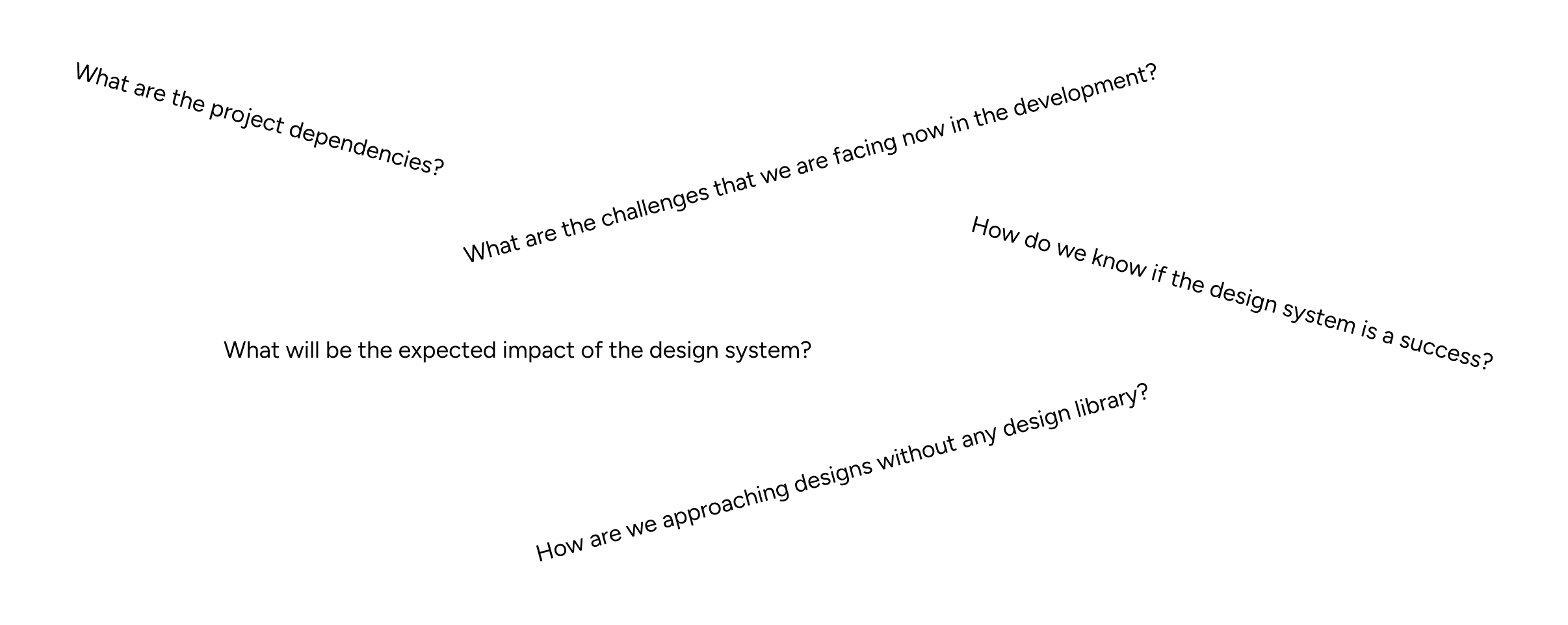
Before beginning the project, it's crucial that I should advocate for the design system and how it can be helpful for our upcoming projects and will streamline the process, ultimately accelerating the development of new products.
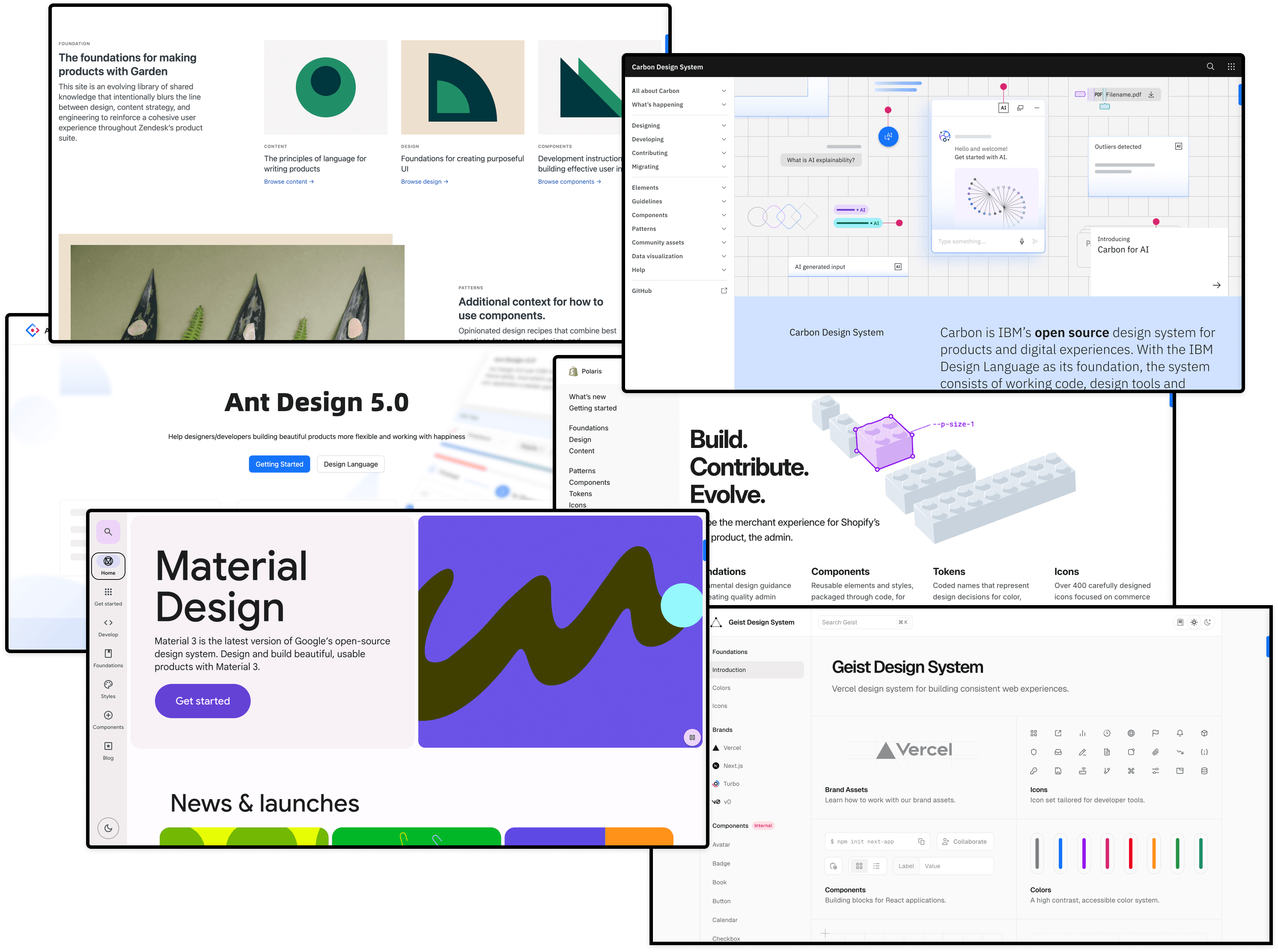
I took a proactive approach by engaging key stakeholders throughout the process. I conducted interviews to deeply understand their needs, issues, and goals, ensuring the design system aligned with both business objectives and user expectations. To bolster my advocacy, I also conducted research by extensively investigating established design systems from major businesses and presented to my stakeholders, to show how design system can be beneficial to the company.
Kicking off the design
♣︎
The begining
♣︎
THE PROCESS
This involves determining our design principles, establishing our design language, creating design guidelines, and implementing and maintaining the design system.
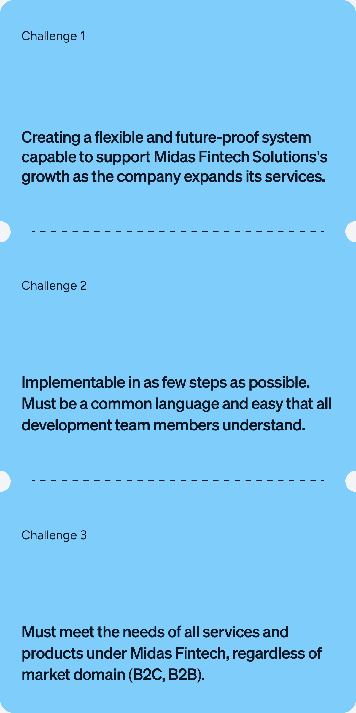
I recognized that this project would demand significant resources, planning, and time, but I was confident it was a worthwhile, long-term investment for our company, brand standards, and, most importantly, our customers.
By creating a centralized design system, I aimed to:
Align our teams by giving them a more structured and guided way to build products.
Accelerate our design and development process, enabling teams to quickly create and test layouts using a pre-built library of patterns.
Enhance brand perception and user trust by delivering consistent, cohesive experiences that empower users to achieve their goals.
Promoting accessibility by embedding inclusive design practices into our component libraries, making our products accessible to all.
STEP ONE
I decided to focus first on the foundational elements of our design system, such as color palettes, fonts, grid, spacing, etc. and then move on to more complex blocks and pieces (molecules, organisms, templates). Since it was the first design system, I created components from scratch so we can curate them as per our requirements.
Some of the activities at this stage involved:
Researching other design systems and interfaces for components common practices and inspiration.
Analyzing the instances and use cases captured during the interviews and ideating on the solutions that serve our goals best.
STEP TWO
I decided to start with the foundational design directives, such as spacing, typography, and colors. It allowed me to create solid foundations with strong emphasis on scalability and semantics.
Typography
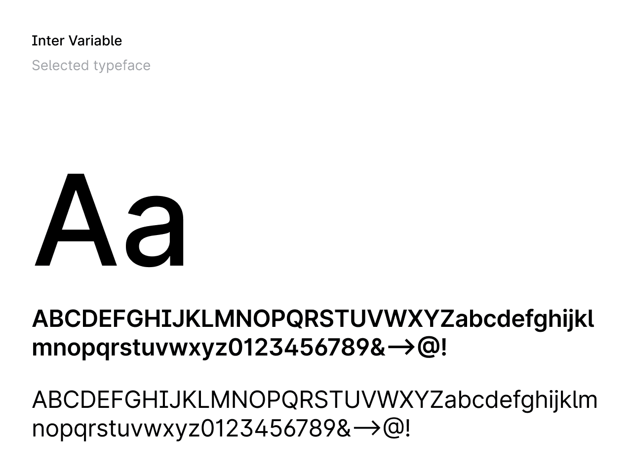
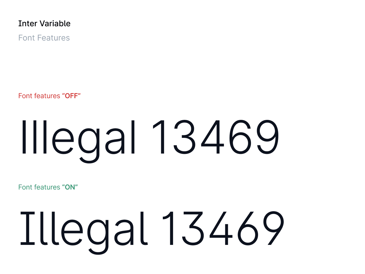
Typography is an important aspect of design systems because it helps to establish hierarchy, create visual interest, and improve readability. I carefully selected a variable typeface that can be loaded on any type of platform easily, is responsive and having various font features that can later cater to our needs to make the reading a lot easier for our users.
Vibrant and accessible color system
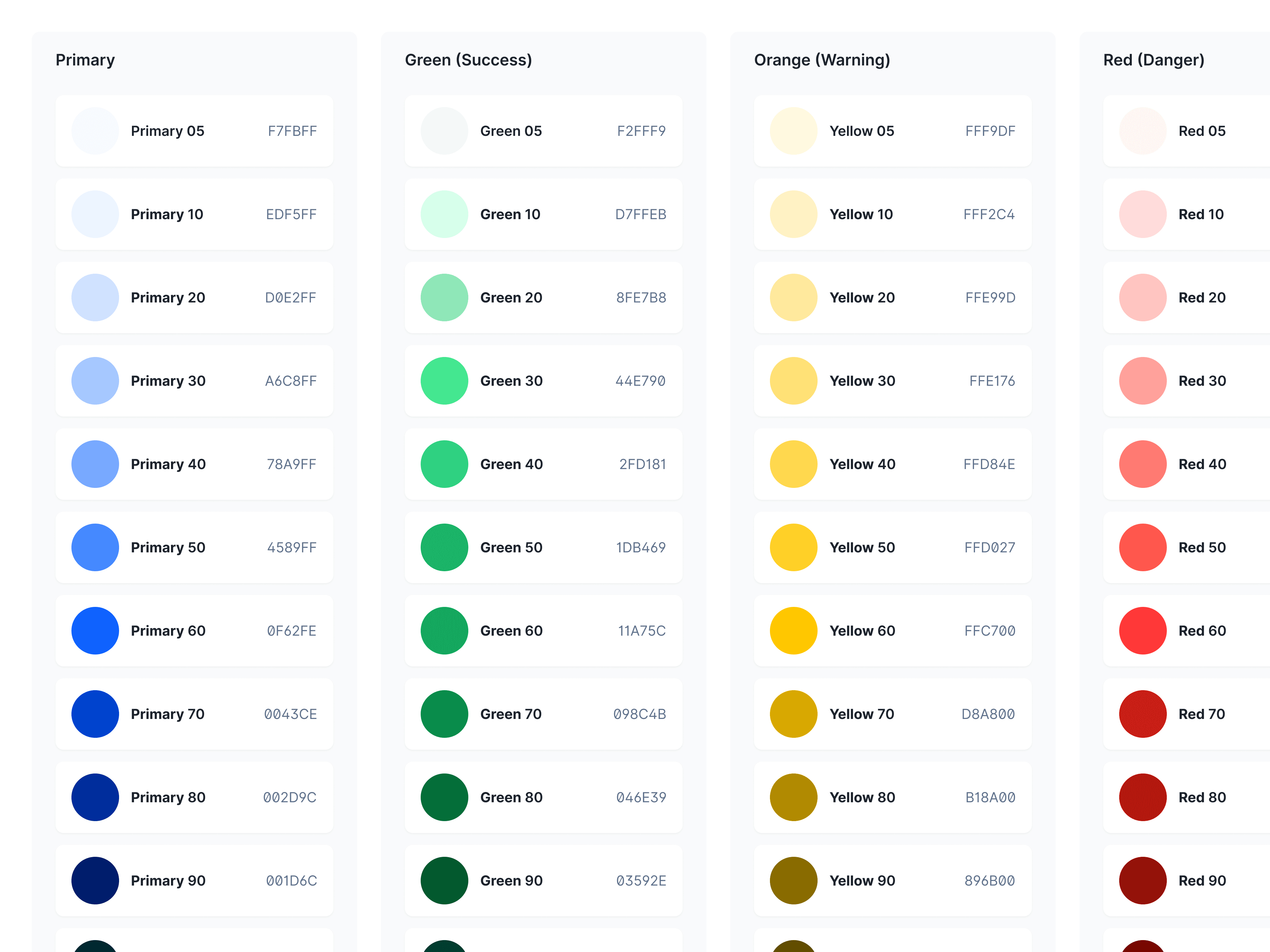
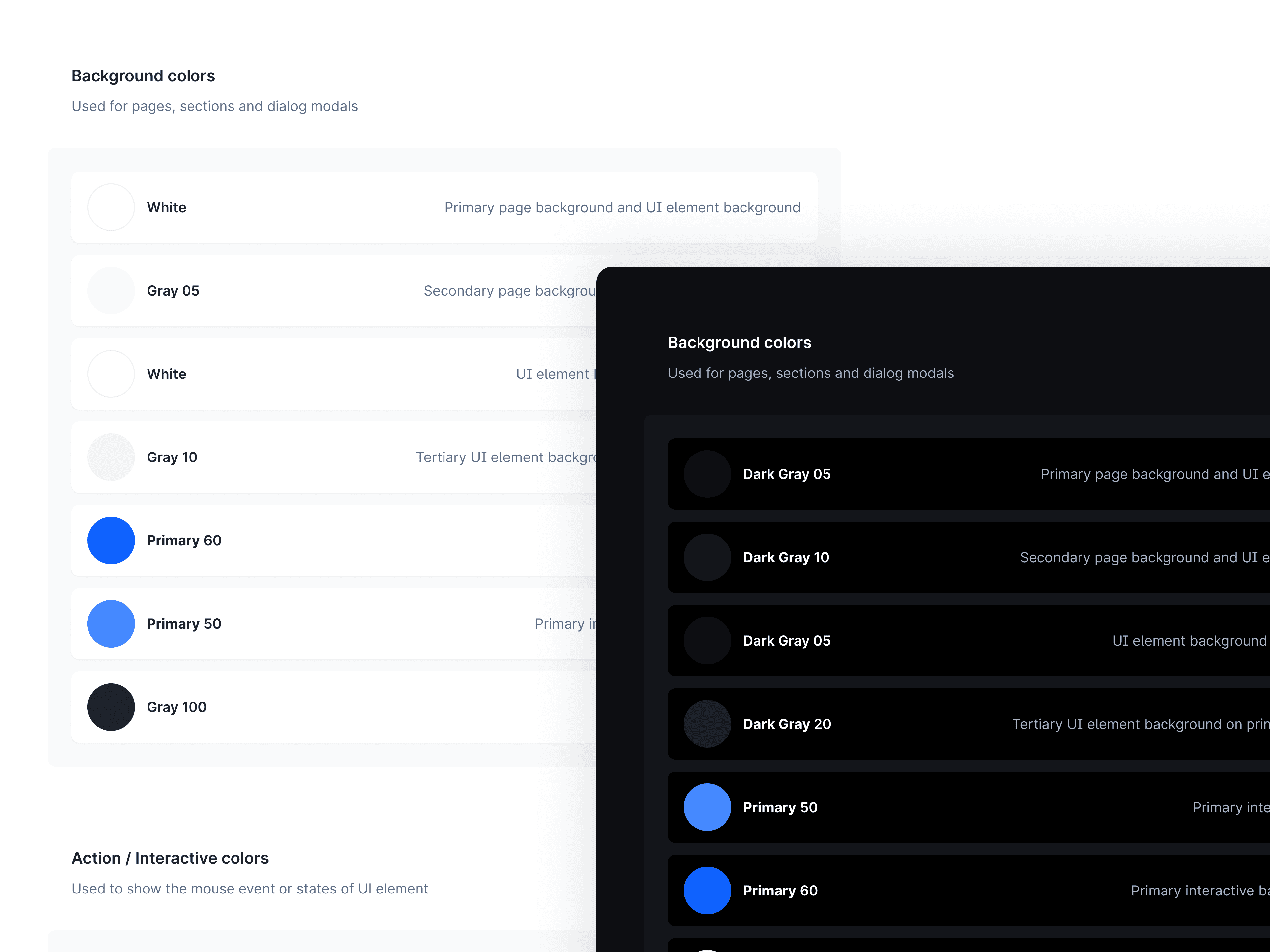
A custom color palette has been created to support the system. It’s a vibrant and accessible palette to enhance the user experience across all of the web products. The colors have also been defined for use in both light and dark themes.
Elevation & Spacings
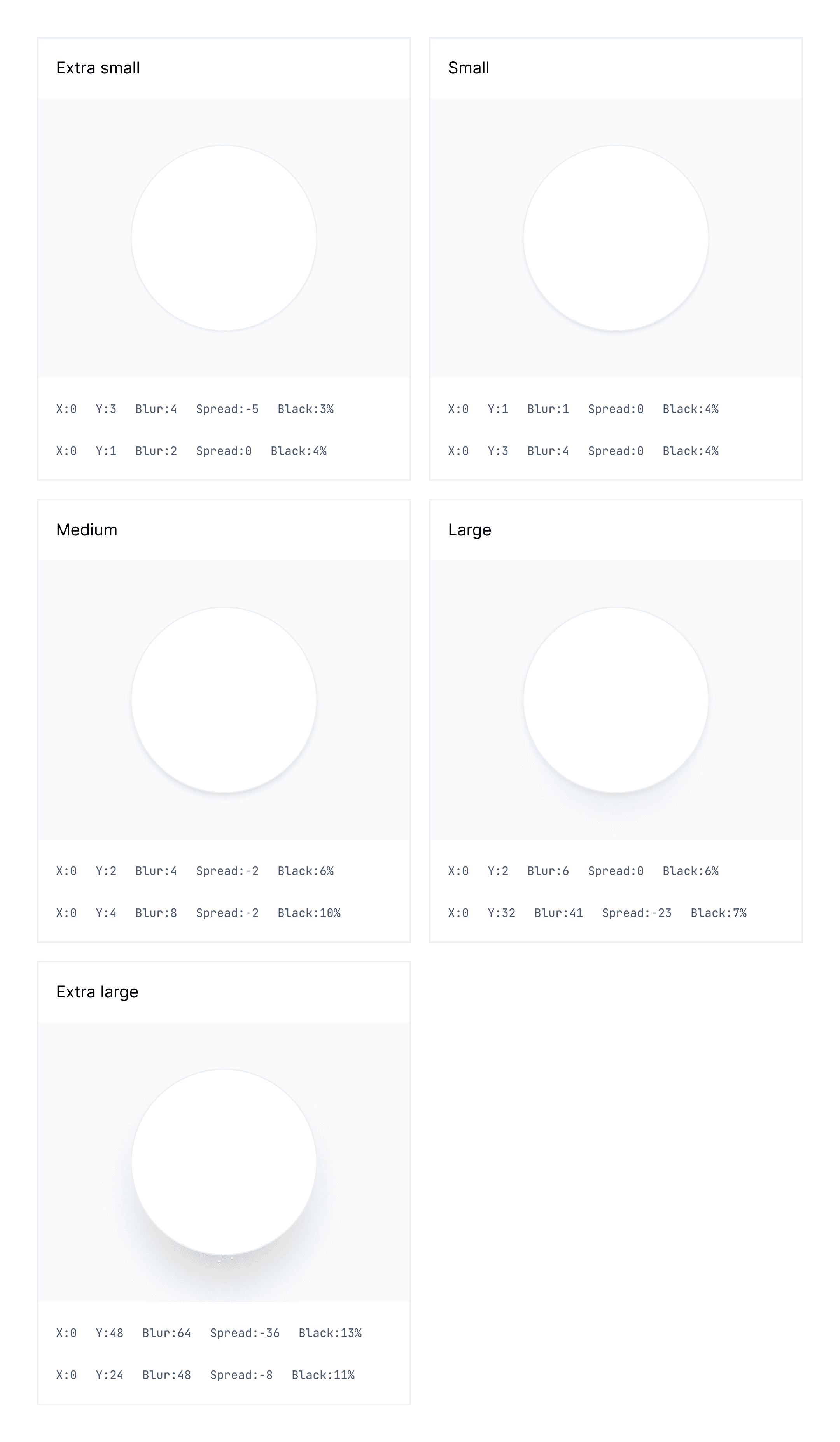
It is good to use an elevation system to differentiate surface overlap. Maintaining a consistent use of spacing in design helps to create a cohesive visual aesthetic across products. In Midas design system I've used a 8px spatial system.
STEP THREE
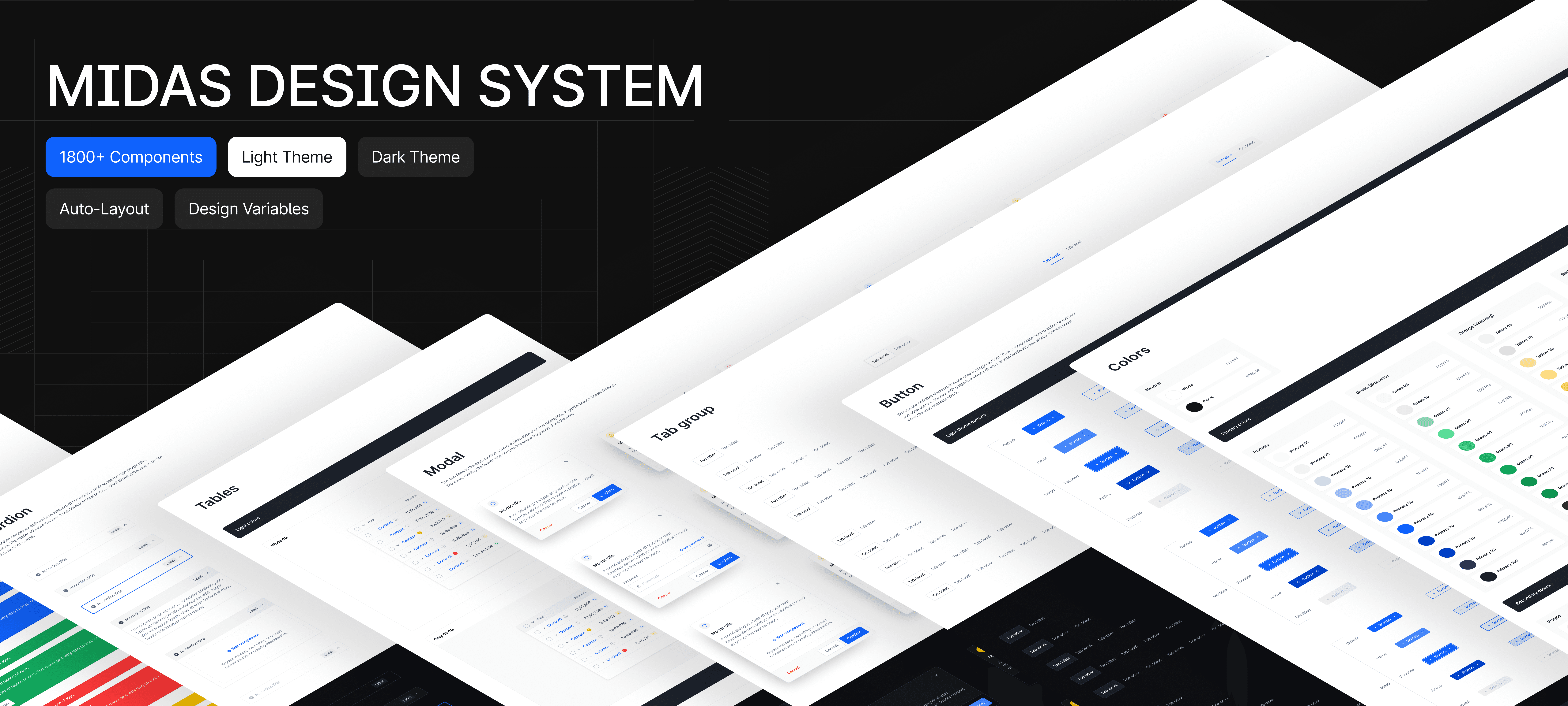
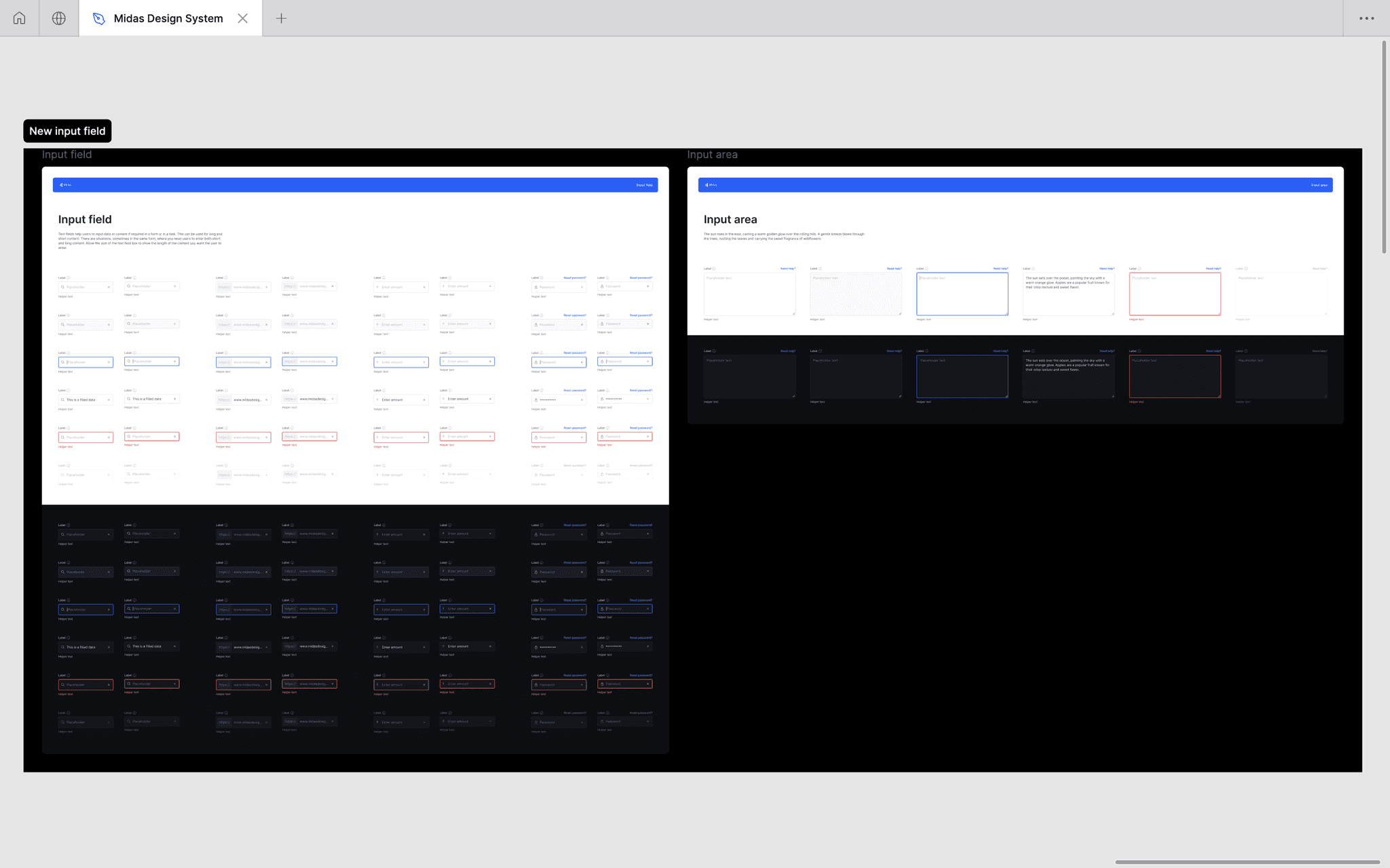
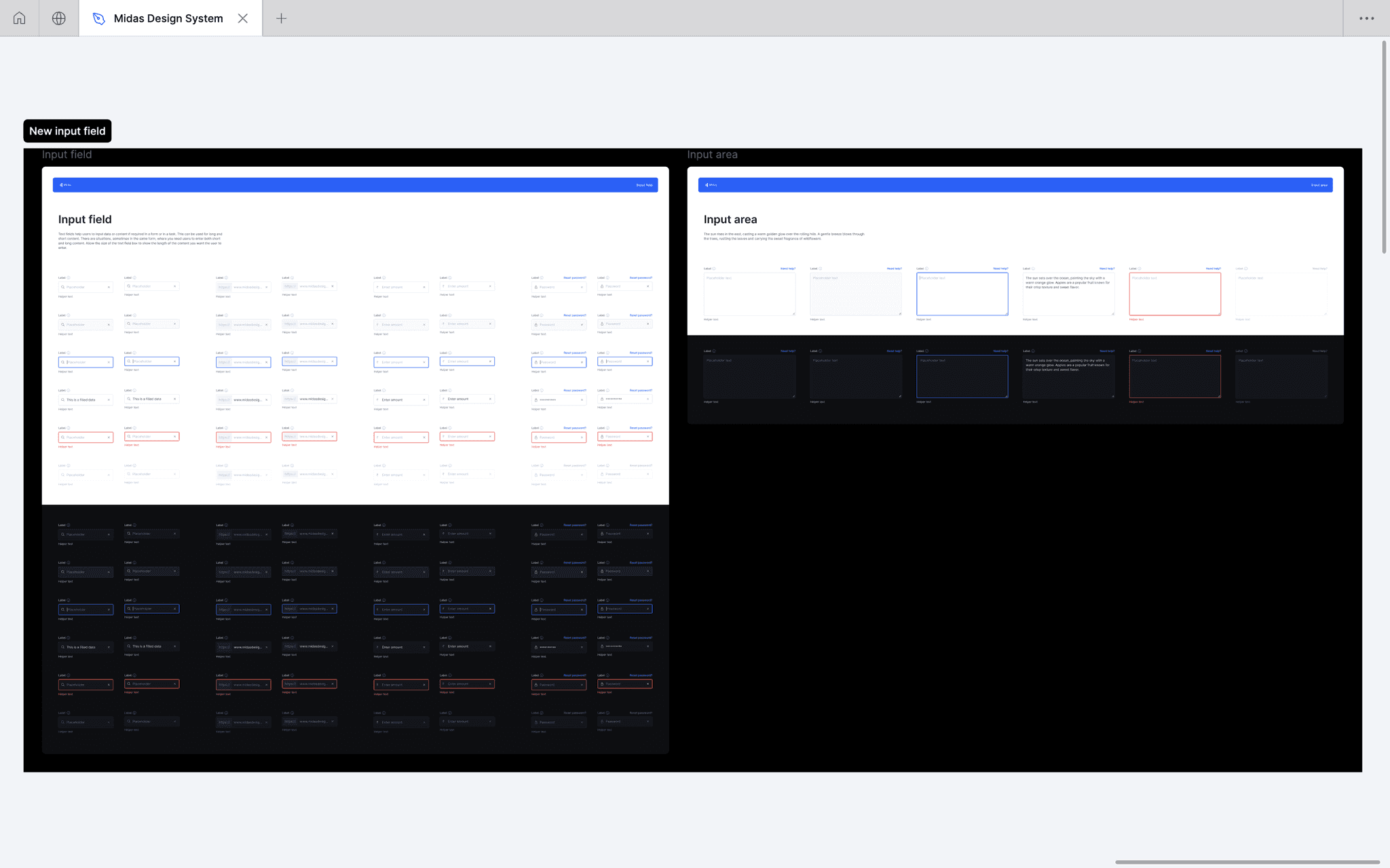
The next part was to extend the visual language to complete the design system, I needed to include a variety of essential elements such as buttons, dropdowns, inputs, and date pickers. I also included more specialized patterns/elements like modals, radio buttons, checkboxes, data tables, pagination options, filters and more.
Components
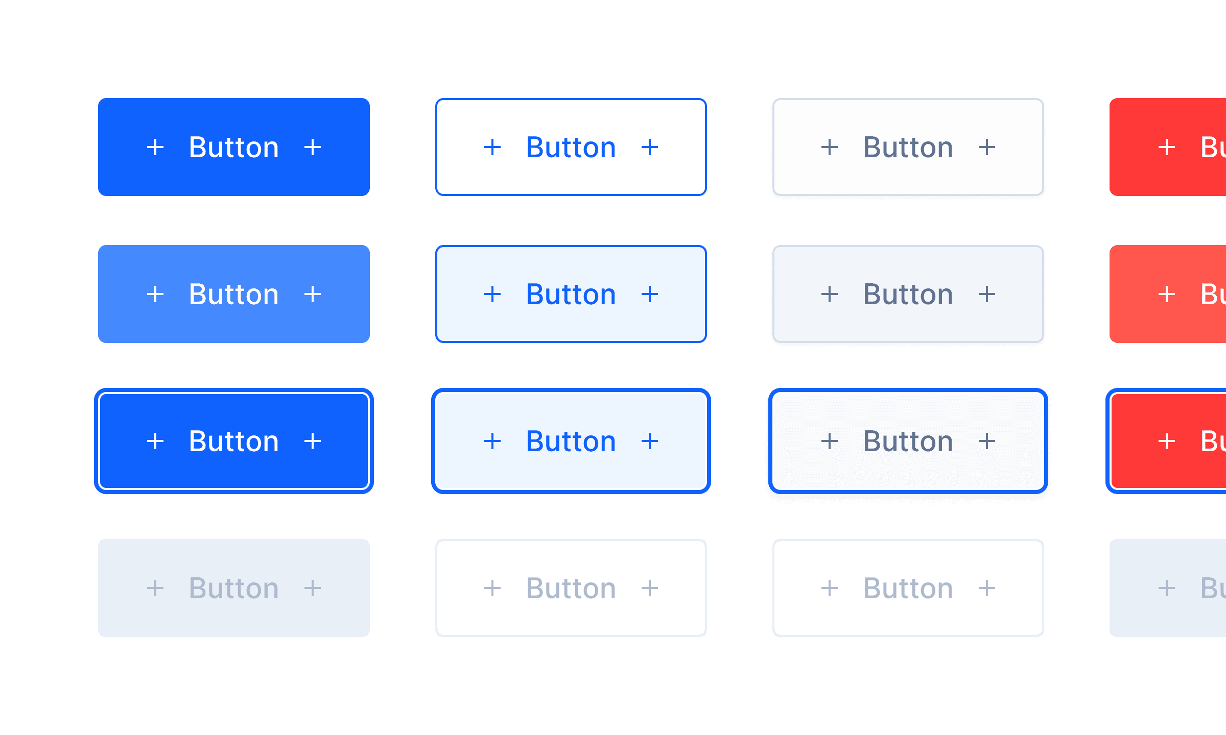
I started working on the components in the design system. I tried to make our components responsive with the auto-layout Figma feature, so we could reuse those components when designing for different devices or layouts. I designed to cover all states in the system like hover, focus, filled out, error, and disabled state.
I used variants feature of figma to combine components into sets with custom properties and values. Using variants makes components easier to maintain, browse and swap through the sidebar menu.
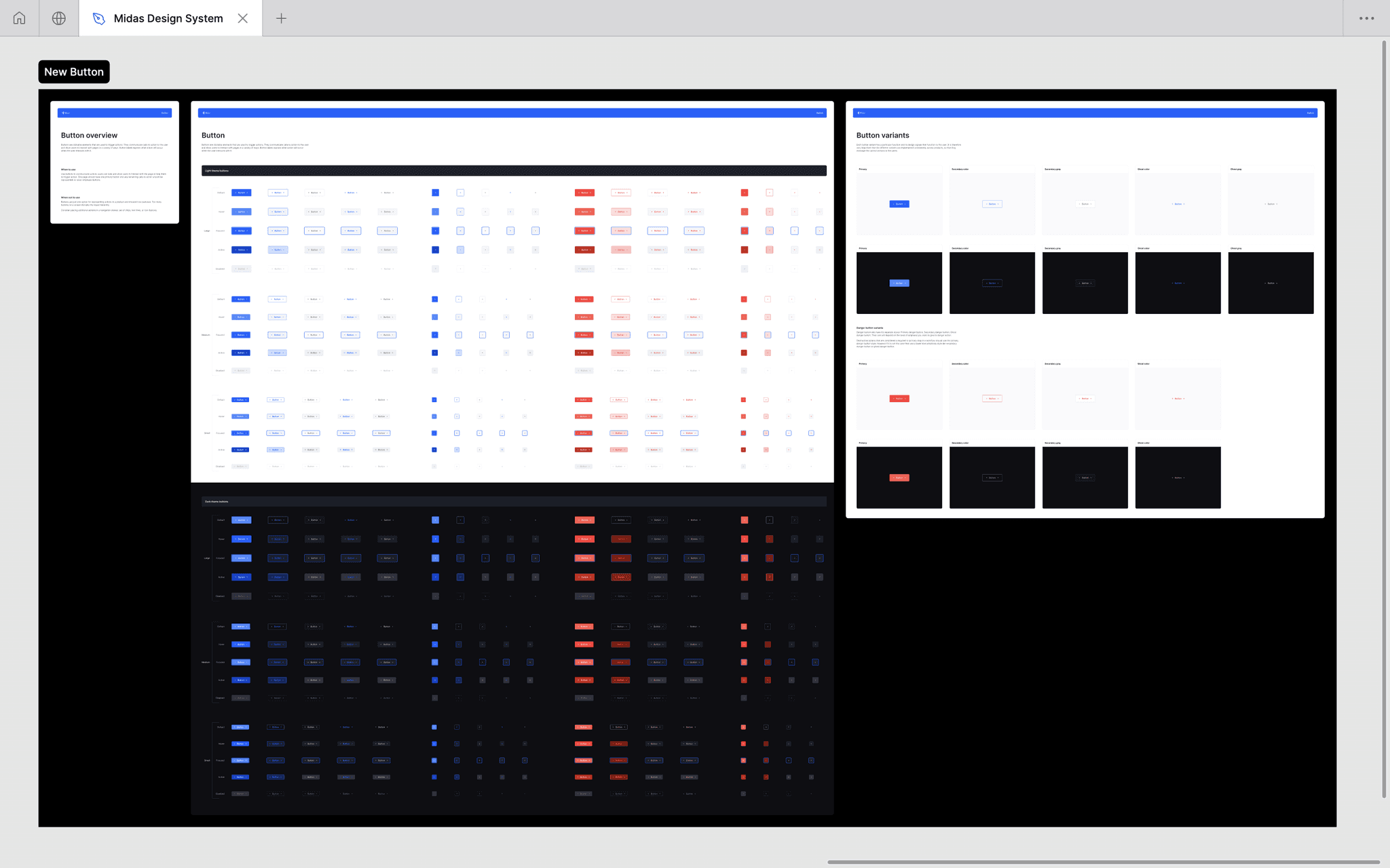
Button
Curated with 500+ variants and 10+component properties.
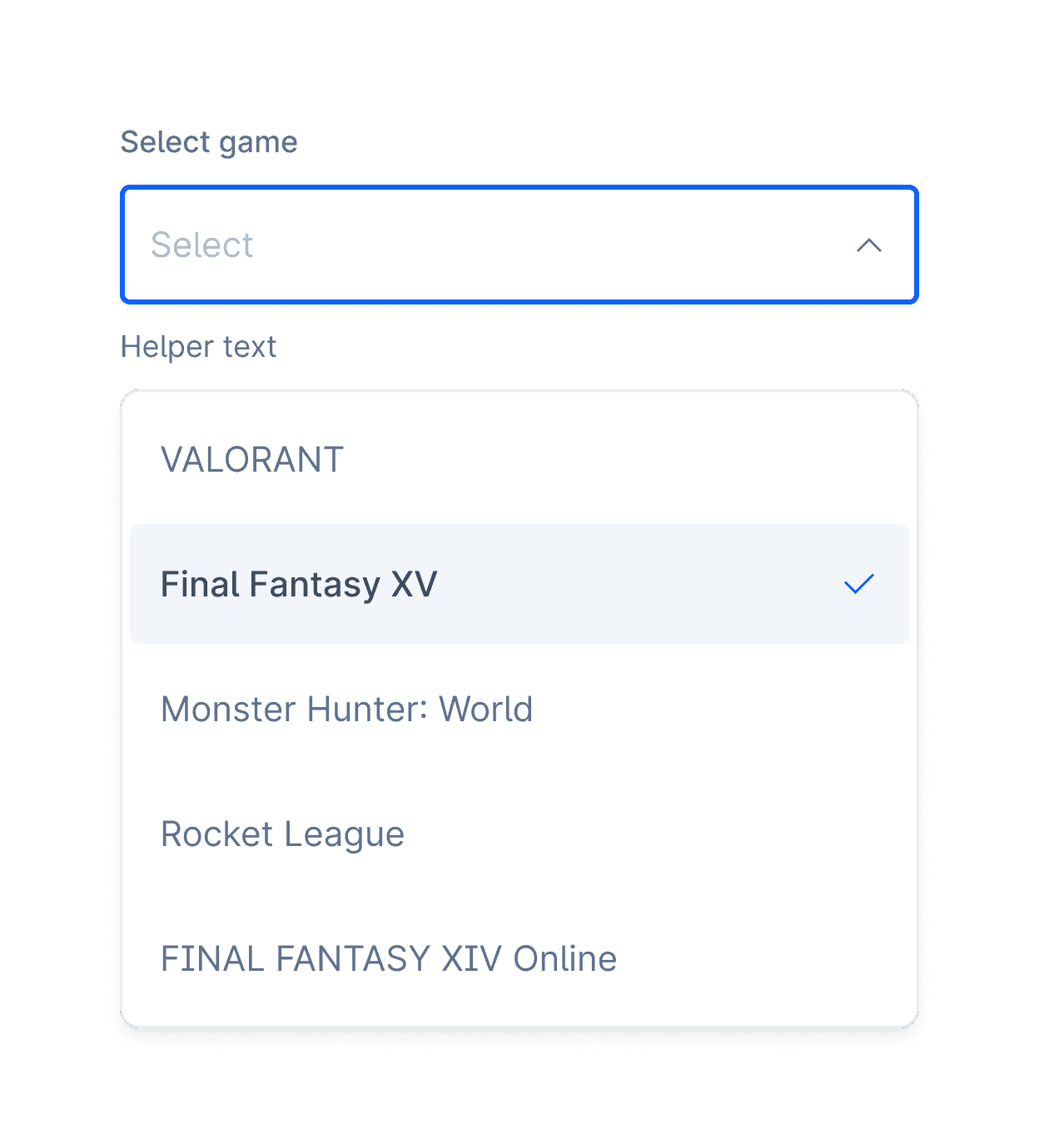
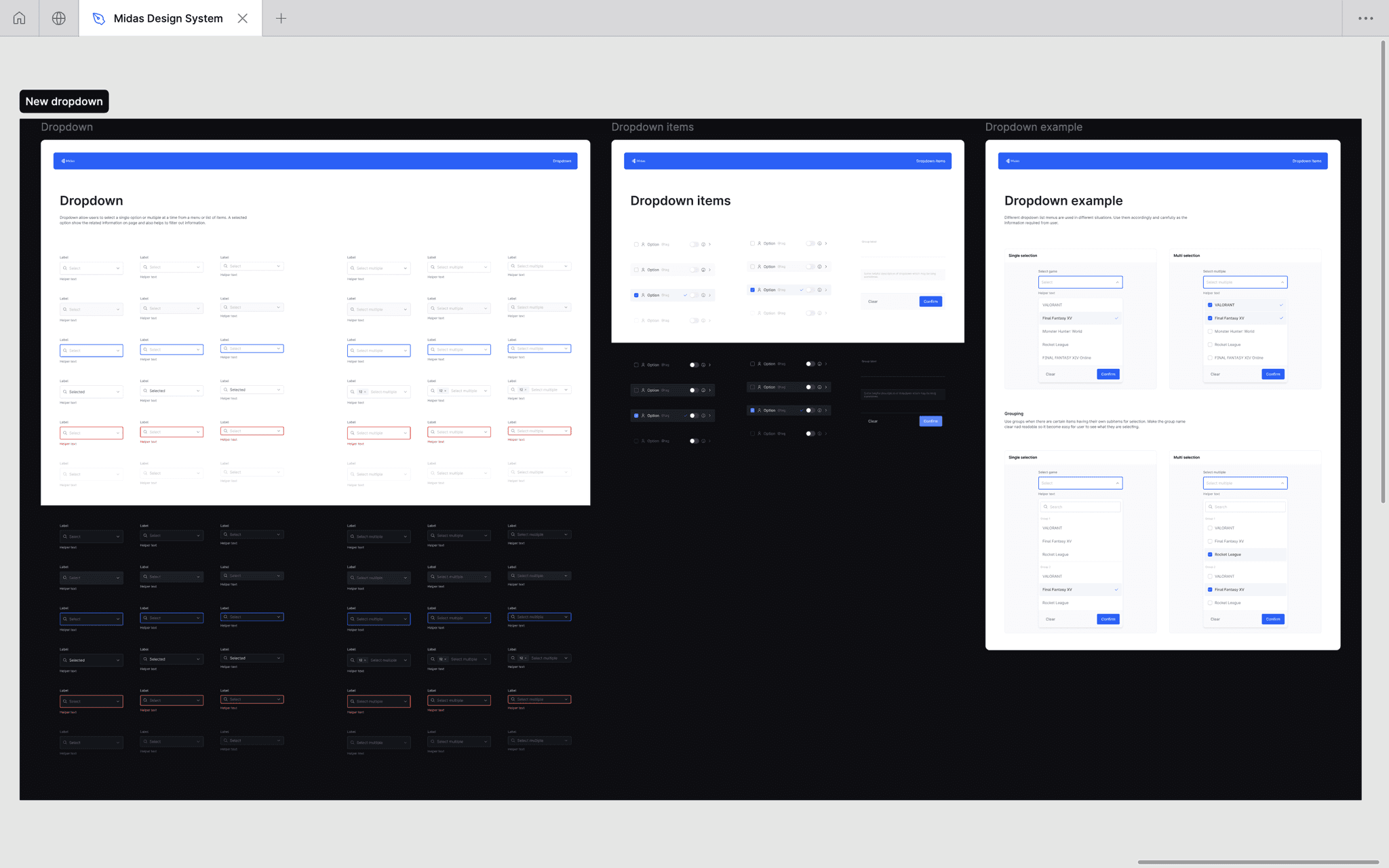
Dropdowns
72 variants with 12 component properties.
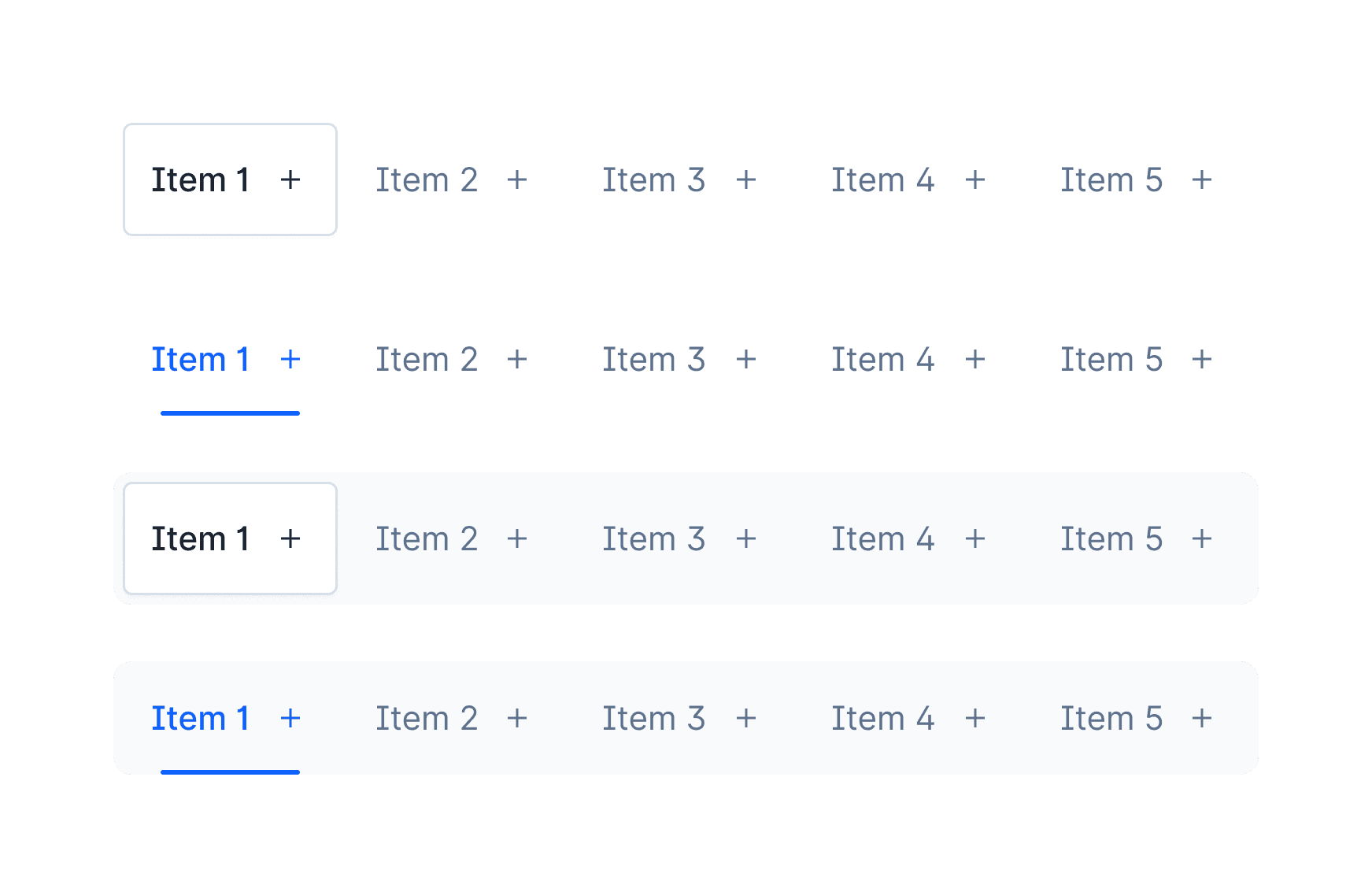
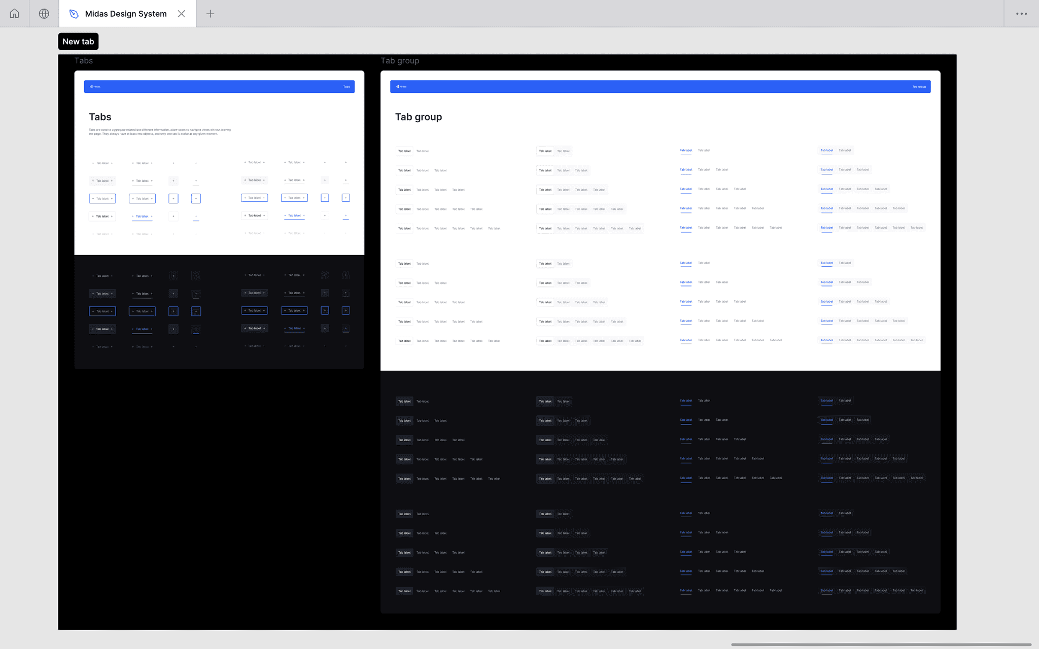
Tabs
80 variants with 5 component properties.
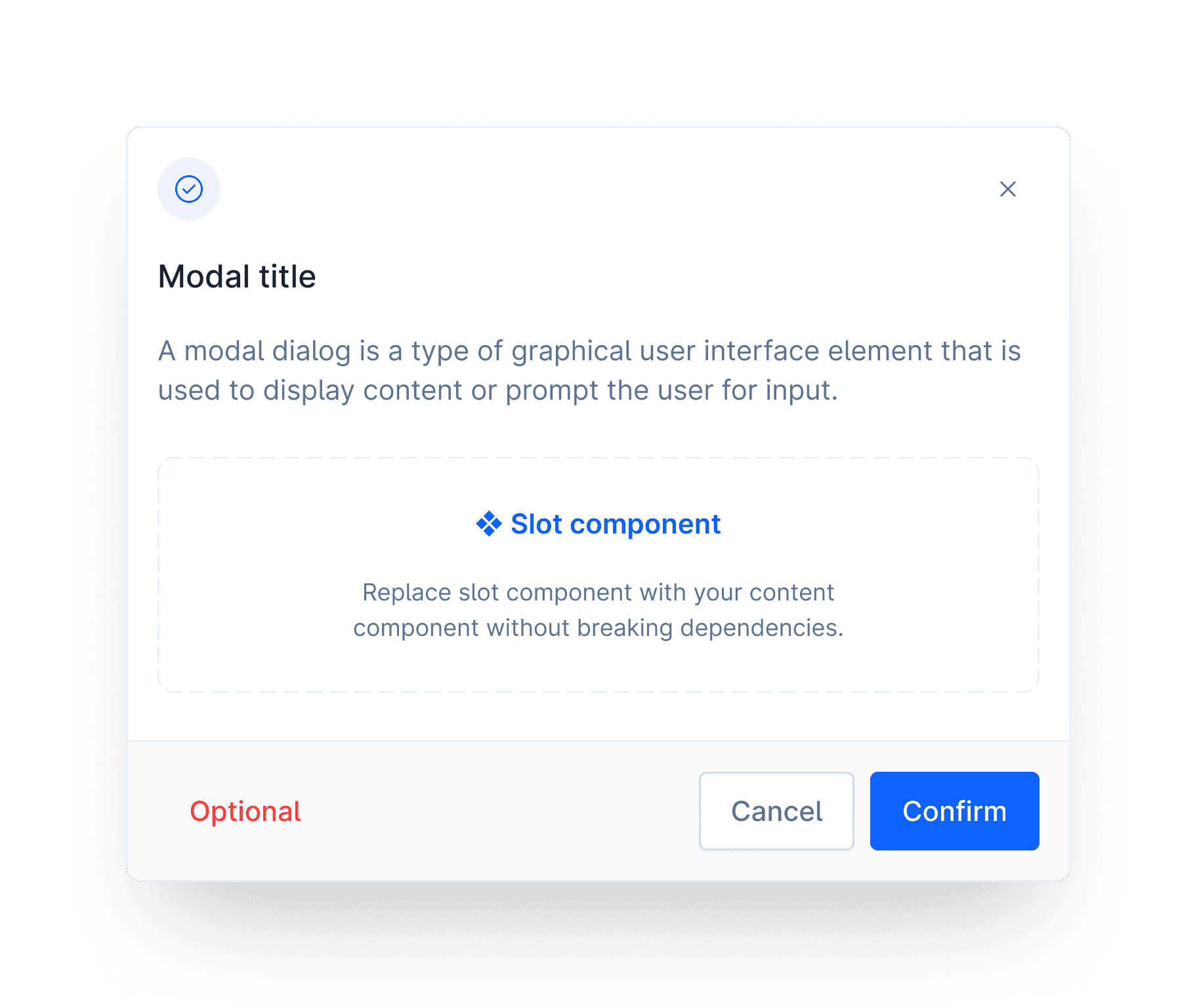
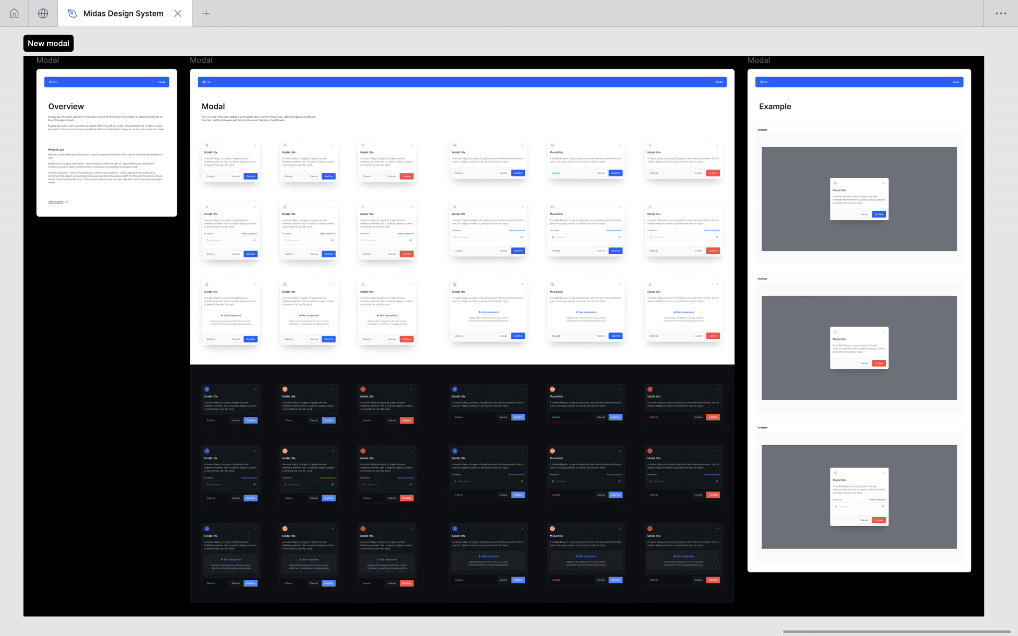
Modals/Notification
36 different variants with 12 component properties.
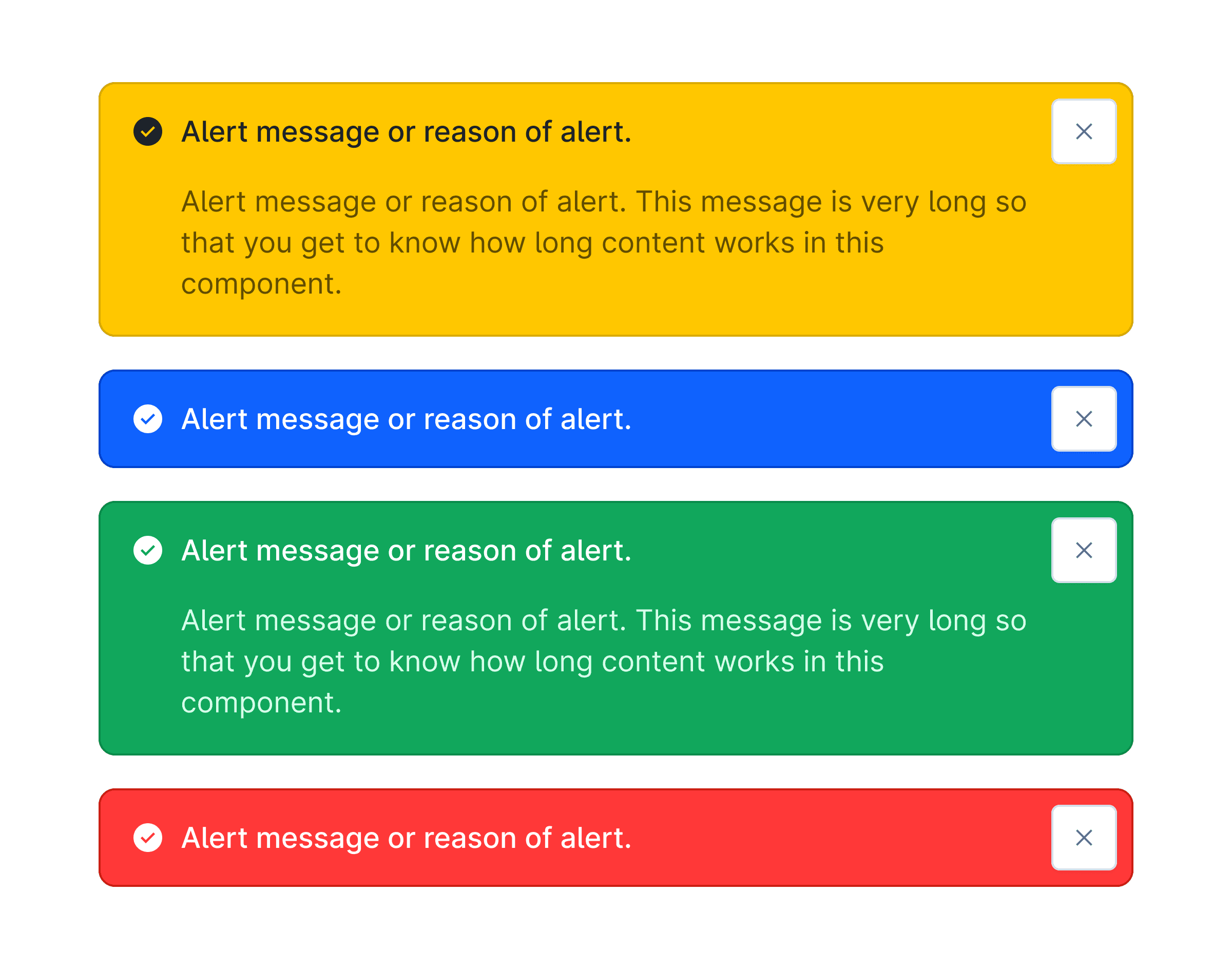
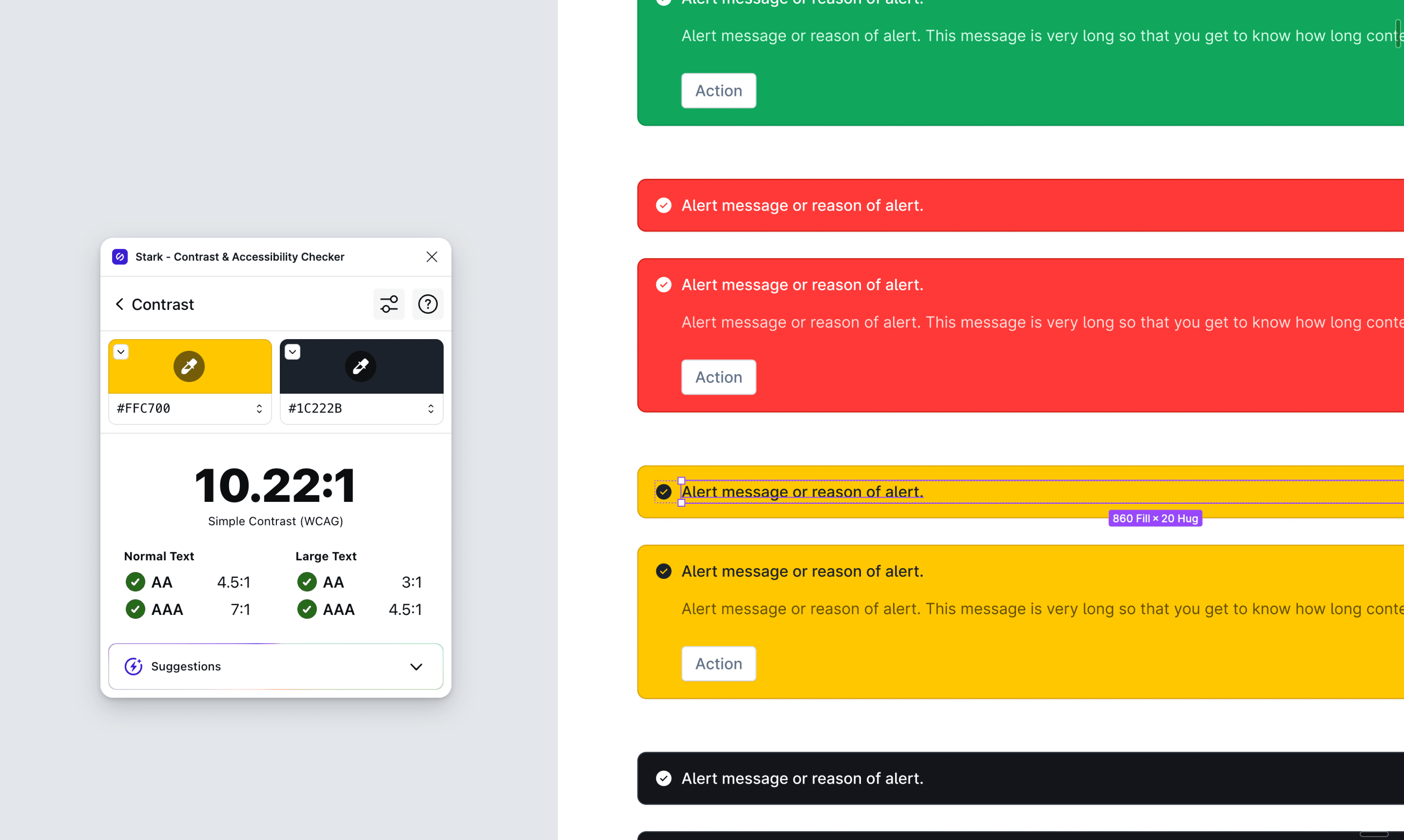
Alerts
10 variants for both alerts or notifications.
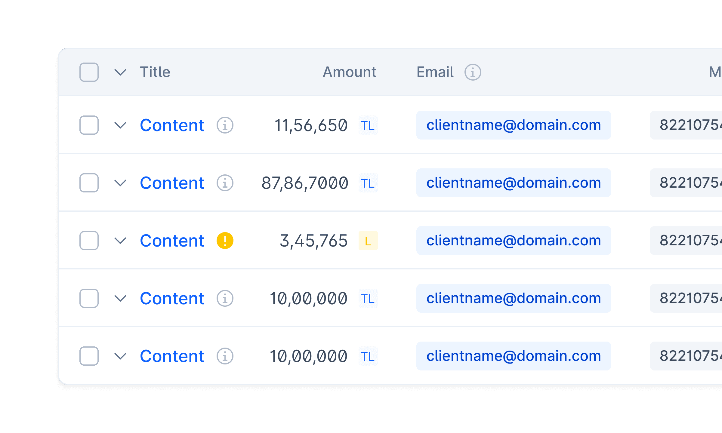
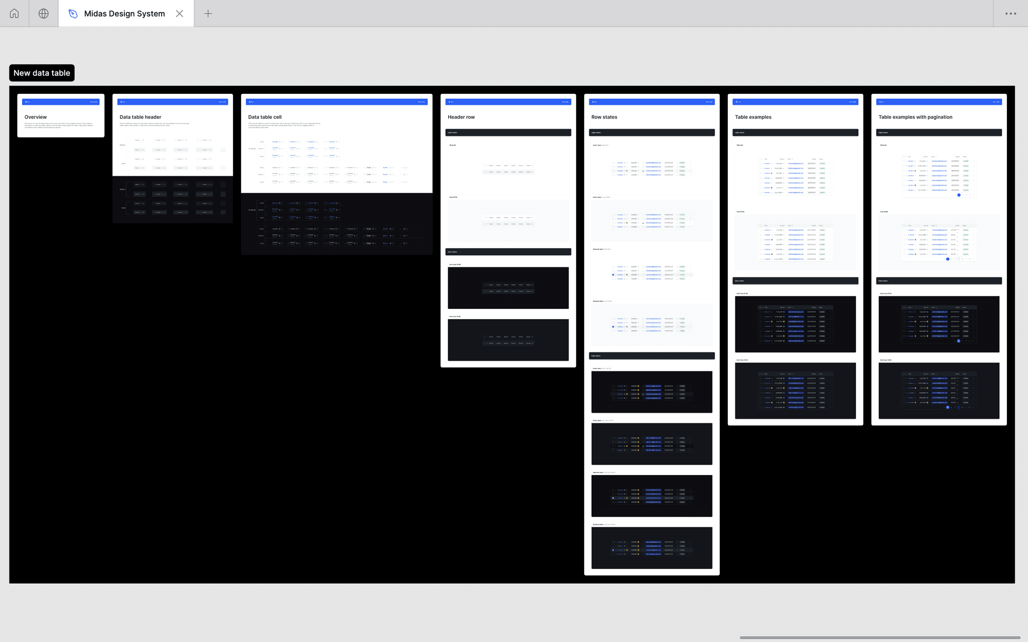
Data Tables
Carefully designed and heavily used elements from design system with creative and innovative approach.
Designed with accessibility in mind
I crafted each component in our design system considering accessibility in mind. I tried to comply with WCAG AA accessibility standards. Below is an example of intentional choice of color on a warning alert to achieve sufficient text contrast (checked via Stark Figma plugin) so that users with low vision can see and use our component.
STEP FOUR
Documenting components and design decisions behind them was one of my core principles when working on Midas Design System. Every component includes a detailed documentation on the behaviour and it's usage.
How it looks in figma
⚑
Inside file
⚑
Quick tour of the Figma file containing all the components and patterns for Midas design system. I highly focused on the layers and pages management because I knew that after a time the layer panel sucks if you don't keep it maintained. Also with managed and properly named layers it was easy to search for design elements as well.
FINAL CONCLUSION & LEARNINGS
Within the organization, utilization of the system increased design and development collaboration. It also served to improve efficiency in developing new tools, leading to a more cohesive, higher-quality user experience. The implementation of the Midas Design System has significantly accelerated the process of designing and developing products, made a huge impact on component usability, and potentially cut the time needed by up to 3 times.
Key learnings
One of the most satisfying moments so far and a perfect project for me to hone my skills.
Design systems are only useful if they are actively maintained and easily consumed by everyone associated in the product's development.
In early stages, sometimes you just need to ship it. Overthinking oftentimes can kill momentum and delay the timeline.
Importance of craft: This is the first project where I really delved into the details and craft of designing. And I love it.
Developing a deep understanding of UI component interrelations and dependencies.
Getting feedback early is one of the best things to do for a new product.
Next steps
Managing and updating the Midas design system is a never-ending process. It is important to maintain robust and up-to-date documentation for design components in order to ensure that they are easily understood and accessible to everyone. Documenting my every design decision so that it becomes easy to scale designs even if I am not there.
You may also like these projects —
